Apartment Brand Design—Behind the Scenes
Stacey Feeney
Apartment brand design is a perfect combination of creative magic and being meticulous. From research to concepts to construction, your careful apartment brand design will help your company inspire while it innovates. And, with any luck, you’ll have fun doing it.
Bring function, creativity and artistry to your apartment community through the precise steps of brand conceptualization.
In one creative call, we listened to our client tell the history of the company’s late founder—his family’s background, his passions, his sayings. As we asked more questions, each of these details that we helped draw out created a well of inspiration. Of course, before we landed on a name that referenced the founder’s family ties, which makes for great storytelling, we had to ensure the rest of the brand could keep up. We’ll show behind-the-scenes of every step, so you can see what this looks like in a real-life brand.
Research & Discovery
LET THE IRP INFORM IT
Without research, you’re walking blind. Without discovery, you’re taking chances. Do the work not just behind the scenes—but even deeper. Find out who you want to attract by determining your IRP, your ideal resident profile. When you can identify who you want to reach, and get to know “who” they really are, you can tailor your brand to attract and retain them!
What does this research look like? Look at geographics, demographics, psychographics, and behavior.
CREATE BRAND VOICE CONCEPT
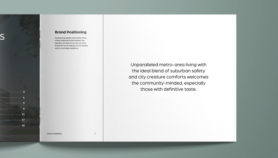
How are you speaking to your IRP, and how do you engage with them? The research you did to find their psychographics and demographics will help you choose properly here, too. What problem is your apartment community solving? Why do you exist? What are your mission, vision, and values statements?
When you create your brand voice, you also get to pick out the brand personality to help flesh out your brand, making everything about your brand easier to explain. Styles, habits, goals, priorities, and values all come to light with the mission and the personality outlined.
Logo Concepts
Collaborating on apartment brand design is a careful dance. Working with client preferences and using our expertise, we came up with a variety of logos for their team to review. (We’ll get to the corresponding color palettes, lifestyle stock photography, and textures/patterns in a second.) We always have our favorite apartment brand logo design—but we know we won’t make the final decision!
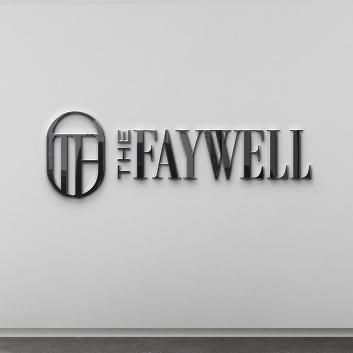
This concept had a solid, signet ring appeal to it. Classy and classic.
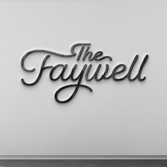
This logo concept offered a softer touch, with a breezier angle.
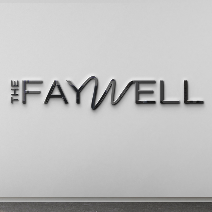
This concept felt a bit like “conventional, with a twist.” It’s fun to color inside the lines for a time, go a little wild and come back to order. A touch of fun.
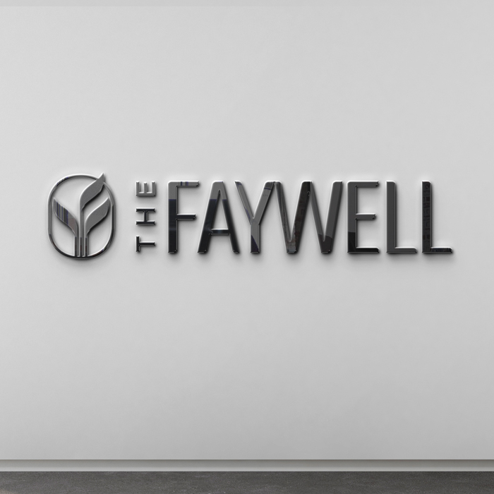
Situated in the city of Wheaton, the logomark called out the location while keeping the typography modern and stately.
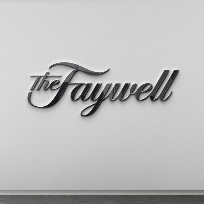
This one says “expect much more from your apartments—and we’ll be ready.” Serious and stylish.
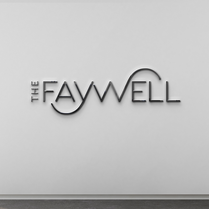
Light, simple, easy, and beautiful. A sans serif with sweet curves attracts those looking for ease of living.
Each of these logo concepts, paired with brand visuals and brand style concepts is created with a slightly different vibe.
This approach offers so much more than only a logo could. A logo cannot bring out a full color palette. A logo cannot give insight into the lifestyle that your apartment brand (and its) design offers.
Brand Visuals and Brand Style Concepts
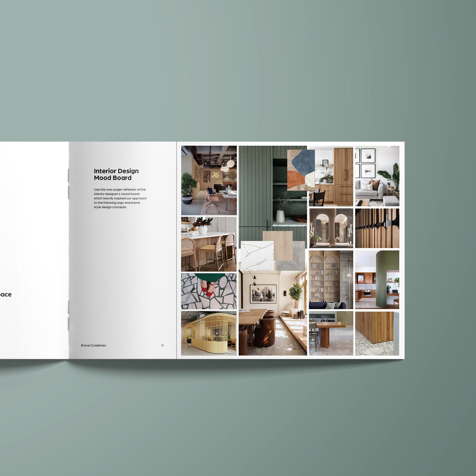
Visually, brands have to make an impression. To accompany the logo concepts, our team put together beautiful stock photography, corresponding color palettes, and textures and patterns that work with the possible architecture, interior design, and typography details. Each concept works with the interior design—so the color palettes are a little bit similar. Additionally, every concept is created with the IRP in mind.
Each of the brand visual concepts that we created for the team at The Faywell was made to attract working professionals with discerning taste. With patterns and with photography, we further focused the vibe, whether eco-friendly, street chic, or totally hygge-homebody. See for yourself:
THE BRAND STYLE VIBES BREAKDOWN
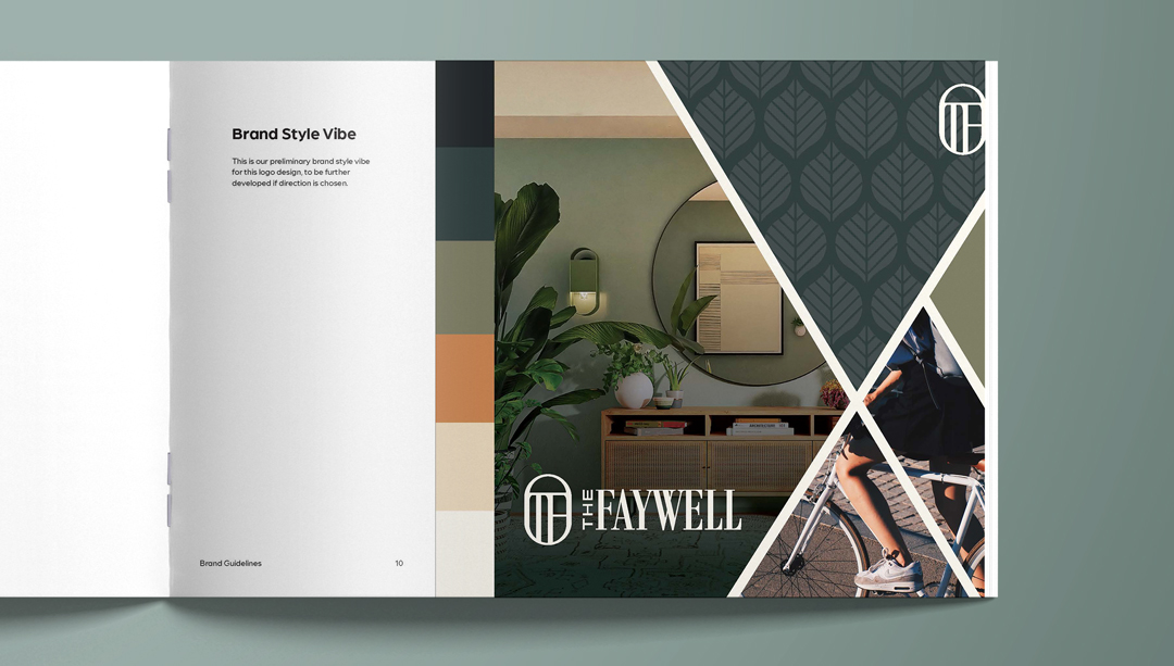
Concept 1
The leaves and the bicycle and the natural sage green featured in this concept tell the viewer: Embracing the calm of nature is still possible in the suburbs of Chicago.
IRP factor: Our IRP desired the calm of outer city limits while still staying stylish.
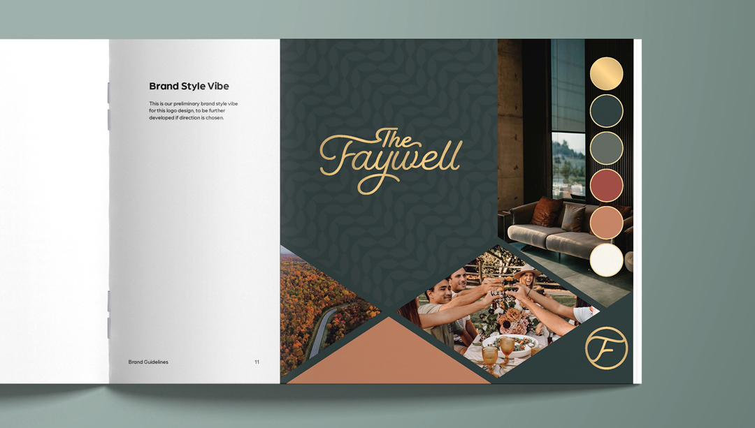
Concept 2
The rich tones of this brand style concept are focused on enjoying friends, going for scenic drives, and sinking into velvet sofas. The repeating pattern of subtle, soft, geometric leaves feels equally mesmerizing and soothing.
IRP factor: Suburbs for city dwellers can feel like social isolation—turning the focus to gathering and experiencing nature reframed the idea of getting out of town.
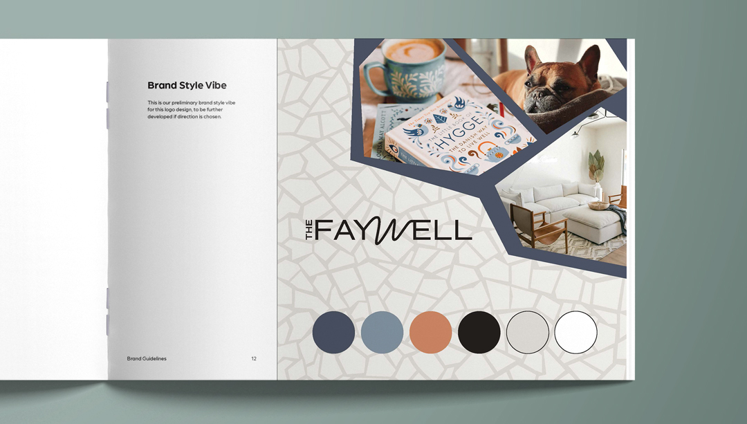
Concept 3
Nothing to see here but cozy, creature comforts. With soft neutral tones, this warm concept is welcoming, cushy, and appealing in a Danish sort of way (pastry or country, you decide).
IRP factor: Our IRP is likely a city commuter. Home should be a haven for them.
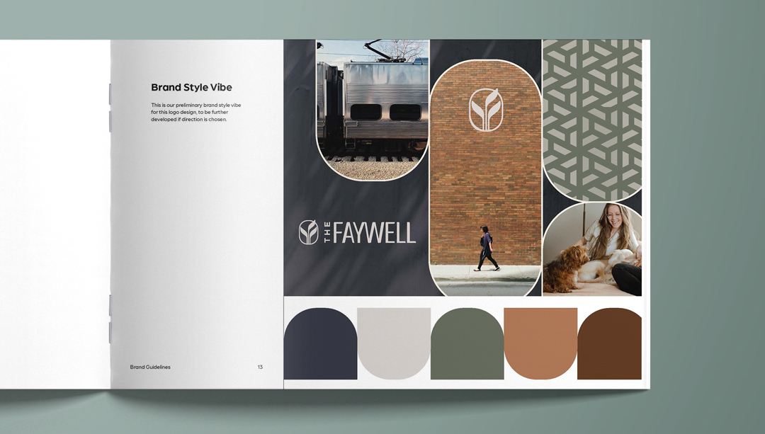
Concept 4
Welcoming city-smart commuters and appreciators of strong, sturdy patterns and structure, this concept is as sleek as it is sweet. Muted earthy tones along with shiny steel train cars offer a perfect balance between city and home.
IRP factor: Predictability should come standard for the resident who needs the train to run on time and wants an unfussy home, so we kept things strong and clean.
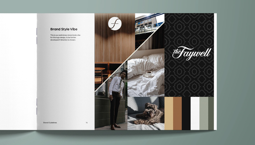
Concept 5
Totally classic like a Fender hollow body electric guitar. White linens, wood walls, tailored pants all go together to create a scene that’s ideal for the keep-it-cool crowd.
IRP factor: Just because the IRP isn’t living in the city doesn’t mean they’ve lost all their street smarts. Creating a luxuriously beautiful.
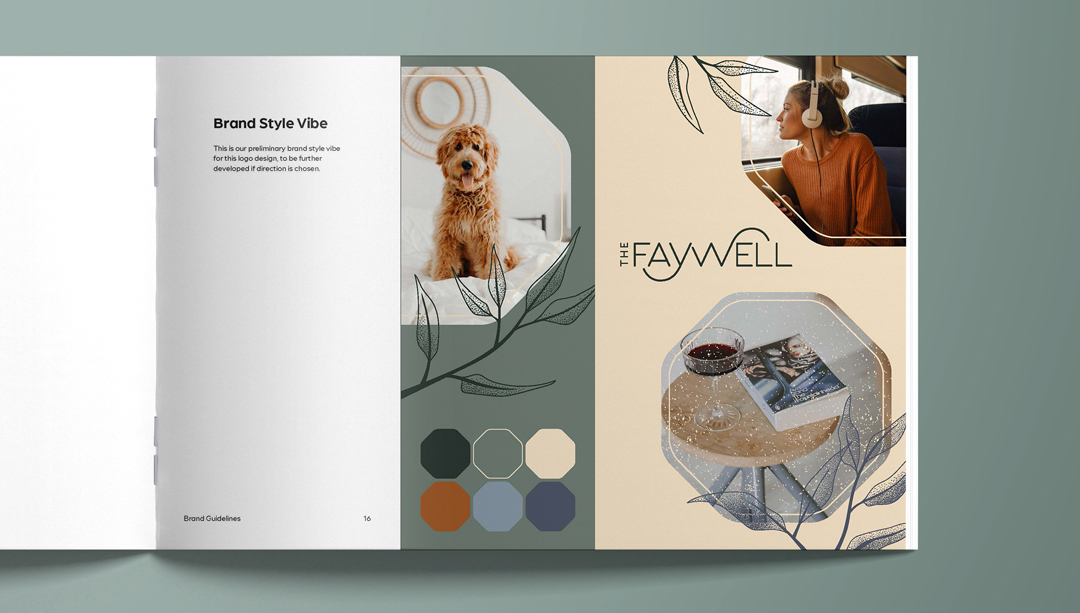
Concept 6
An easy going, enjoy-every-day vibe is happening here. Planning out your day with podcasts and enjoying a small glass of wine with your new pageturner, simple joys are the foundation in this take on The Faywell.
IRP factor: The hustle and bustle of the city isn’t for everyone, but having a predictable, reliable, and comfortable home is for this IRP.
Conversations Around Concepts
COLLABORATE AND CONVERSATE
After we presented each brand concept with the team at The Faywell, there were plenty more conversations to be had. Using the concepts, visual or verbal learners among the stakeholders (VP, marketing director, or owner) could easily process each concept and collaborate in conversation with us, the creative agency.
After you speak with the stakeholders, you can unite behind a singular concept when you determine which one will speak to your target resident while you represent your company (and its vision) clearly. The name, the logo, the photos, the color palette, the typography, it must all work harmoniously to give your prospects the most idealized version of your brand and your company’s priorities for their future residents.
THE POINT OF APARTMENT BRAND DESIGN CONCEPTS
Everything you’re investing time into now is meant to be a shortcut for you in your marketing, and to help you become a fully fledged apartment brand. When you start with the idea behind the vibe, the trajectory of the brand you’re building is a lot less bumpy. Branding involves a lot. Put in the work now to create a solid brand today and in the future.
We look forward to seeing how The Faywell continues in their brand journey.
