


Accent Colors—How to Add To Your Apartment Brand’s Palette
Stacey Feeney
Color theory isn’t theoretical in terms of importance for your apartment brand. It’s part of your overall identity and will definitely impact how your prospects (and anyone else who comes in contact with your brand) view your apartments or corporation. Accent colors are a helpful way to expand your branding guideline’s use.
If you already have a color palette established, choosing additional colors can seem risky or difficult. Let’s walk through choosing excellent complementary colors that will work with the branding you already have.
This will help you select accent colors to make your brand pop.
Ready?
Let’s pop.
Background: Color Theory Basics
Let’s get back to Art 101 here, including parts of the color wheel (which has 12 parts). Plus a couple definitions that may be helpful:

Color Types
Primary – Red, yellow, and blue. You can make any color from these.
Secondary – Green, orange, and purple. Basically the other part of the rainbow, made from primary colors.
Tertiary – Mix a primary and secondary, get one of six tertiary colors. Like Red-orange.
Color Characteristics
Hue – The color—or the name we give it. Every color has a basic hue—which would have to be one of the primary, secondary, or tertiary colors. (A lavender color has a purple hue.)
Saturation – The vibrancy or intensity of a color—the lower the saturation, the less vibrant it is.
Brightness – The shade or tint of a color.
Contrast – How one color stands out from another.
Each of these color elements impacts perception of your brand. And every color has an associating idea and mood. If you’re familiar with those ideas, it will help you narrow down your choices. For example, green is typically seen as soothing and natural. Purple is associated with royalty and luxury. Blue is trustworthy.
(Read more of the color psychology breakdown in our blog here.)
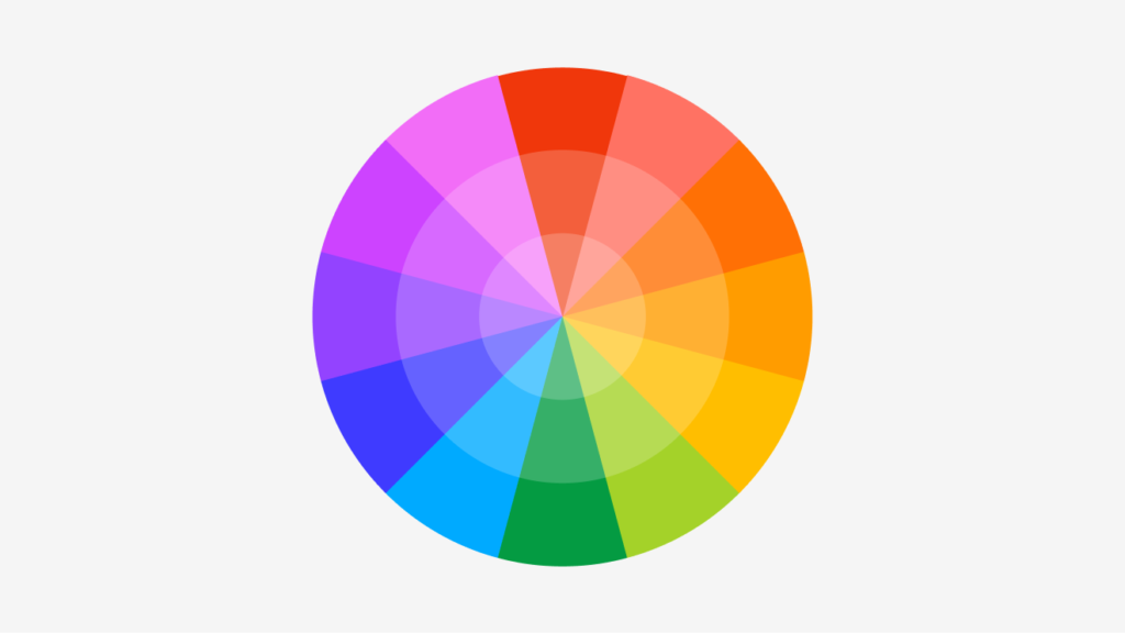
Complementary Colors
Those that are opposite each other on the color wheel—and they tend to look good together. Think: orange and blue, yellow and purple, red and green.
But if you’ve already got a color palette, and you’re just adding to it, it’s helpful to know what will work best.
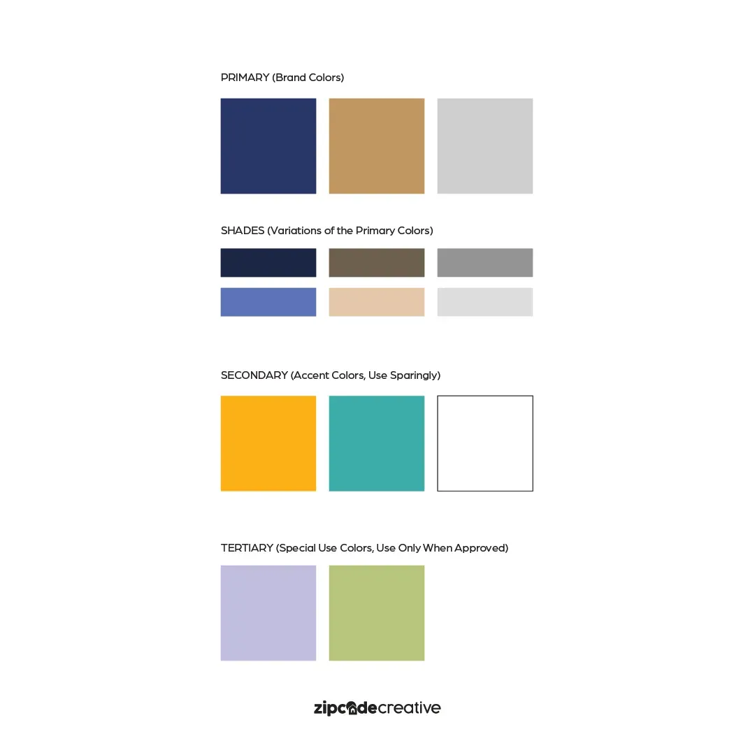
Adding to Existing Color Palettes
You already have brand colors? Start there. Look at what it has going on. Does it have a little bit of everything? Figure out what, if anything, is missing.
First– try the analogous, complementary, and split-complementary colors. Second– try using varying tones of the same hue to gain color through lighter or darker versions of an existing color.
BEST PRACTICES
Accent colors should be just that: an accent. Certain colors will “pop” against the rest of the palette and can draw attention to the things you want to highlight for your residents and prospects. They should be used sparingly, as they’re not the main idea.
Also: keep it simple. Don’t go overboard with too many colors; it just muddies your brand recognition. When you have 3-4 main colors and 1-2 accent colors, that’s the sweet spot. If you have more, your brand recognition will have diminishing returns. Think about Coca-Cola. They have, what, four colors? Red, white, black, and gold—and nothing else. And you can picture the colors in your head. If you want brand recognition, keeping it simpler will be helpful. Find the best possible color pairings and go from there.
POLICE IT
We’ve said before: If it’s “close enough” it’s not good enough. Every color has a specific pantone, RGB, CMYK, and HEX code. Use them and show the team how to use them.
Without proper training, you’ll end up with things that look kind of right, but maybe a little off.
Plus, when it comes down to holiday and/or seasonal creations, it may not be obvious what’s allowed or not—so get ahead of this and indicate what is permitted for, say, Christmas or Thanksgiving posts in regards to color palettes and accent colors.
Once you have your color palette and brand guidelines, you need to stick with them and make sure everyone else does, too.
BEHIND THE SCENES
Go behind the scenes with Stacey Feeney, our Founder & Chief Creative Director, where together you will learn how to add colors to an existing, limited brand color palette.
Lease a
